How Do You Ensure Data Integrity in Cubes?

A friend of mine recently asked for assistance on creating a custom DLL. I’m a total n00b at this. But, i asked him, why he was pulling his hair over this.

He wants the DLL to implement data integrity in the cube. For example, in a customer dimension with SSN as an attribute, he was hoping, a DLL can be created to ensure that SSN is always 9 digit number.

I had no clue. However, I’ve suggested him to use constraints in the sql table, source data warehouse itself. Check constraint on SSN column can get the job done.

There are many benefits of using constraints in the data warehouse for this particular case:

  • Check constraints are simple. Even people like me, with no knowledge on DLL’s can maintain them.
  • They ensure that data in the warehouse is clean. You don’t want to allow 15 digit number for SSN, for example.
  • Only the data warehouse contains source data for cubes. And if data here is clean, there is no way bad data is entered into the cube. At least in the perfect world.
  • With clean data in the warehouse, reports can consume data from either warehouse or cubes.

What’s your approach?

What would be your approach to this problem? Did you create a DLL? What other solutions do you have?

You are welcome to post a comment below.

~Sam.

SQL Saturday US Map

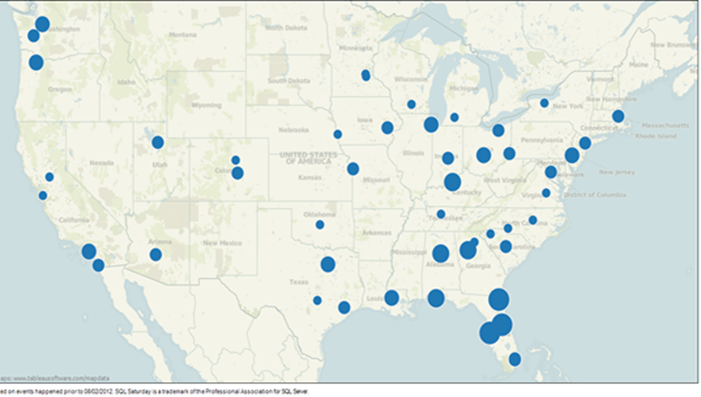
Apparently, SQL Saturday isn’t popular in the west. See for yourself. I wanted to see what cities frequently host SQL Saturday and ended up creating this dashboard. There are some interesting findings. Look at how the events are primarily confined to only (right) half of United States. There are several states that haven’t yet seen a SQL Saturday!

image

I created this using Tableau Public. Unfortunately, functionality of the dashboard on this blog is limited, so I encourage you to click on this link to see an interactive map.

Which state has conducted the most events so far? That’s right, it’s the Sunshine state. Good guys in Florida are outstanding by conducting 20 events already.

I hope this post is fun. Your comments are welcome. Cheers!

I’m @SamuelVanga on Twitter.

Creating Your First SSAS 2012 Tabular Project

No matter how simple it is, new things come with some confusion; at least until you get used to it. Analysis Services 2012 Tabular is no different. This post will look at steps to create your first Tabular project.

Let’s start with firing up SQL Server Data Tools located under Microsoft SQL Server 2012 RC0. I’ve selected to create a new project.
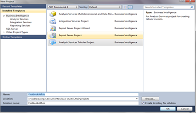
SQL Server 2012 SSAS Tabular Project

In the above image, I’ve selected Analysis Services Tabular Project.

You might see a error message similar to the one below. This happens when the server instance specified in the Workspace Server property doesn’t have an analysis services running in tabular mode. For instance, in this example the name of my instance is localhost\SQL110, but I purposefully changed it to an incorrect name to show this error.

SSAS Tabular Workspace database server error

To fix this, I’ve changed Workspace Server to the correct one from the properties of model.bim
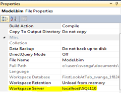
image

Importing Data

The Model option located on the top allows you to create model files. You’ll begin with importing data from a source.

image

The next screen lets you select a type of data source. I’ve selected Microsoft SQL Server. In the next screen, you choose a server name and database name as the source.

You’ll provide impersonation information in the next screen. This is important because, analysis services uses this account to connect to the data source. So, make sure that this account has required permissions on both the server instances: data source and analysis services.

Next screen asks how you want to import the data. You can either choose from a list of tables or view, or specify a query to retrieve the data. I’ve opted to select from a list.

From the list of tables and views in the below image, I’ve selected FactInternetSales, DimProduct, DimProductSubCategory, DimProductCategory, DimCustomer, and DimGeography.

image

Clicking finish will complete by the data import and the next screen displays a status of the tables and views that were imported.

image

Toggle to the diagram view to see the tables and relationships among the objects in the model. In the below image, you’ll notice the wizard identifies the relationships in the data source.

image

Toggle to the grid view to see the data that was imported from data source to the model. This interface looks similar or Excel workbooks with one tab for each table in the data source.

image

Create Measures

The first thing you should do after importing data is to create measures. I’ll select Sales Amount and choose Sum from the measure drop down in the following image.

image

I’ve repeated the same steps for Tax Amount, to create another measure.

Deploy To Target Server

Before deploying to the server, take a few seconds to verify the target server properties. Target Analysis Services must be running in tabular mode.

In the below image, I’ve selected to deploy the model.
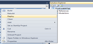
image

Browse Your First Tabular Model

I selected Analyze in Excel option located on the top. An excel pivot table with a connection to the model you just deployed allows you to analyze data in Excel.

image

Conclusion

Well, Well, Well. I know this has been a lengthy post. So I’ll let you go with no further ado, but please use the comments below should you have any questions or comments.

~Sam
BI Pyramid (read categories of users in a BI solution)

Purpose of any business intelligence solution is to provide users information and enable them to make intelligent decisions that benefit their business. But one size solution doesn’t fit all.

Depending on their job duties and where they fall in the management chain, users can be categorized into at least three groups. A successful BI solution will come in different flavors to fulfill the requirements of these different users.

A pyramid resembles the users in an organization.

Operations: Draw two imaginary lines horizontally across the pyramid dividing it into three sections. The bottom section is the widest, this can be attributed to a group of users that are responsible for day-to-day operations, running business as usual (BAU). These users will be interested in transactions and detail data. Report requirements from these users are predictable, predefined and standard. Predefined or canned reports from components like SSRS, Excel are created for this purpose.

Analysts: The next level up is a group that can be called data analysts or middle management. Identifying trends, detail business analysis, strategic decision-making is carried out by this group. They usually start at a place, drill down into more details, slice and dice the data across different areas. Report requirements from this group are unpredictable. Ad-hoc reporting capabilities are to be provided to them by using tools like report builder, excel pivot tables, power pivot for excel.

Executives: Last but not the least top section of the pyramid represents the key group of users that make executive decisions. Users like sales managers, execs. They are highly interested in summary information like yearly sales amount, total items sold etc., In addition these users can’t spend a lot of time to go through all the reports and get what they want. Dashboards will provide executives the ability to get results fastly.

In summary

Canned Reports for Operations
Ad hoc reports for Middle Management
Dashboards for Executives

~Sam